

Growth without growing
10 charts on growing the new-fashioned way

a portfolio prelude
breaking: a prominent author does a chart foul
NYC a case study in jobless recovery
a reminder that it’s a national story
doing more with less is the name of the new(ish) game (Goldman cops to it)
we’ve tried to do this before (the curious case of the Dotcom recovery)
no mass RIFs in peacetime
👉👉👉Reminder to sign up for the Weekly Recap only, if daily emails is too much. Find me on twitter, for more fun. 👋👋👋Random Walk has been piloting some other initiatives and now would like to hear from broader universe of you:
(1) 🛎️ Schedule a time to chat with me. I want to know what would be valuable to you.
(2) 💡 Find out more about Random Walk Idea Dinners. High-Signal Serendipity.Growth without growing
We begin with a chart foul, and middle- and end with a chart-flurry of “yes, this really is different, but it’s been a long time coming.”
But first, a portfolio prelude.
A portfolio prelude: compression ftw
Random Walk’s little gas compressor that could keeps on cooking:
For the third quarter of 2025, contract operations segment revenue totaled $326.3 million, an increase of 33% . . . Total operating horsepower at the end of the third quarter of 2025 was 4.7 million, compared to 4.2 million at the end of the third quarter of 2024. Utilization at the end of the third quarter of 2025 was 96%, compared to 95% at the end of the third quarter of 2024.
Pricing on our installed base continued to increase on a sequential basis during the third quarter of 2025 . . . Adjusted gross margin percentage for the third quarter of 2025 was 73%, compared to 67% in the third quarter of 2024.
AROC 0.00%↑ is hitting on all cylinders.
adding hp
utilization higher, pricing power higher
margins better
All of which led the company to once again revise guidance upwards.
It’s fun to be right for the right reasons.
But, to repeat the obvious, this isn’t investment advice, do your own diligence, rely on nothing I say, because I’m surely not to be trusted.
Growth without growing: a chart foul
Derek Thompson, of Atlantic fame, sounded much better when he was just rehashing old Random Walk posts, albeit two-years too late.
Mr. Thompson, unfortunately, did not read Random Walk closely enough, because now he’s just straight up posting dismisinformation chart fouls.
Behold, what Mr. Thompson considers “the scariest chart in the world”:
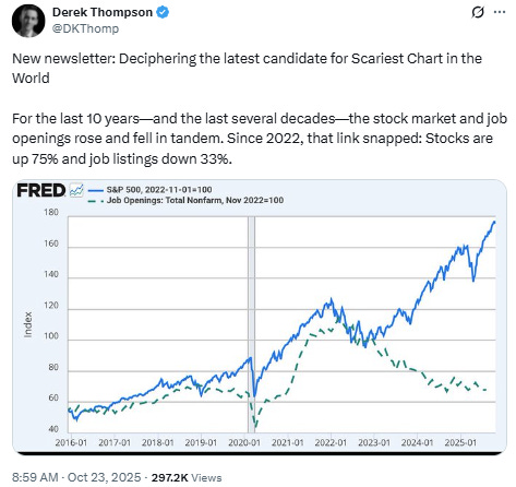
The link between the stock market and the job marked “snapped” in 2022.
Now, in Mr. Thompson’s defense, he is not arguing that the significance of this chart is that “AI is taking jobs,” because even he has come ‘round to the fact that that’s silly.
But there’s a different issue with Mr. Thompson’s observation: it’s just wrong. The link between stock prices and job-growth did not “snap” in 2022. If anything, it snapped in ~2019.
The mistake Mr. Thompson makes is confusing post-pandemic “job recovery” with “job growth” (a mistake which pretty much everyone makes).
I took the liberty of redrawing the chart to better illustrate the point:

We’ve had a “jobless” bullrun since 2019, at least, and job openings really started to go flat in 2018.
That big green bump in “job openings” is a fake-out. What happened is a few million early-retirees left the workforce (especially blue collar), and firms needed to recreate that headcount asap. And so they did, until roughly Q1 ‘24, when things went “back to normal,” the low-income wage premium slowed, and openings:applicants normalized to the status quo ante.
Sorry, Mr. Thompson, if you’re scared now, take comfort in that you should have been scared at least 5 years ago.
ICYMI


NYC case in point
In case you needed more reminding that job-recovery is not job-growth, take a look at the latest from the NYC comptroller.
Here’s what the 5-year change in NYC Employment looks like:
